Coloring Book Sale!
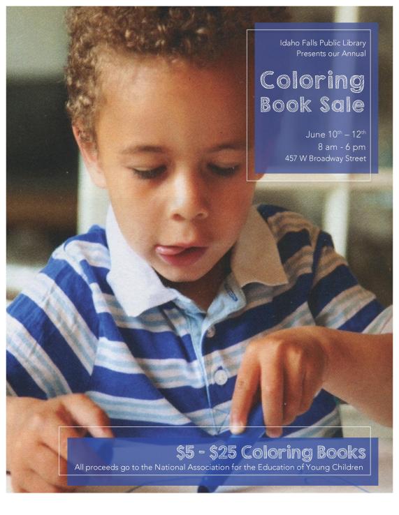
Description: This full bleed flier is promoting a Coloring Book Sale taking place in the Idaho Falls Library to raise money for the National Association for the Education of Young Children.
Process (Programs, Tools, Skills, FOCUS principles): I started this project with a pencil and paper sketching up different formatting ideas. I wanted to have a picture as the full background and when I found this little guy I knew he was the one! Once I found the picture the idea of a coloring book sale came to mind. This flier was designed in Word 2011. I decided on a monochromatic color scheme to keep it simple. I worked on making the left alignment exact, ensuring that both information boxes matched in style and size
Message: I wanted to create a fun message that would draw the attention of both parents and children. I want my flier to portray a fun sale for a good cause.
Audience: My target audience was both parents and children because the parents are the ones to take the action of coming to the sale and the children are the ones that would benefit and be interested in the coloring books.
Color scheme and color names: I chose a monochromatic blue color scheme to mach a compliment the little artists shirt. R,G,B(69,83,151)
Top Thing Learned: There is a delicate balance between simplistic and boring. I started the flier with too little information and contrast and it made my flier look very boring even though I was striving for a simplistic look. Finding the balance takes playing around to find what looks right.
Title Font Name & Category: The title font is a decorative “KG Second Chance Sketch.”
Copy Font Name & Category: Copy font is a Sans Serif “Avenir Light.”
Scanned images: I used the scanner in the Mac lab in the McKay Library. The picture was scanned from the Young Children Magazine – The Journal of the National Association for the Education of Young Children. Original image size: width= 13.361 inches, height= 17.639 inches.

I love your design! The way the blue boxes matches with the t-shirt of the kid blends really well. I also like how you didn’t concentrate the design in one place but instead put a box on top and another at the bottom. You should check this blog : https://tho14024.wordpress.com/
LikeLike
Taylor I love how the picture turned out in your design. The grain in the picture really makes me feel like how I was a kid. I always associated those kinds of hues in a picture to when I was a kid. I like the alignment I feel like you did a great job on that as well.
Check out mine at https://taylorhaydenhill.wordpress.com/2016/05/14/project-2-event-ad/
LikeLike